Friday, 10 January 2014

Evaluation

For the assignment I was looking forward to starting; I liked being in the studio and was eager to be able to expand on my range of knowledge with new equipment. Going into the studio with the group for the first time was a little awkward as there was so many of us and we didn’t really get a chance to do much, we watch the demonstrations and tried to take most of it in. But when we got split up into smaller groups it was easier to get to grips with the equipment as I got to play around with it a bit more.
          
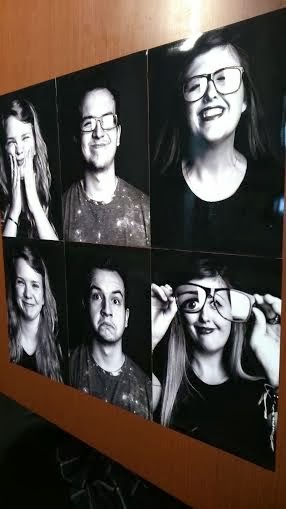
I also went to a talk on Steven Pyke and I really liked his way of photographing and his end results. From watching this I new I wanted my prints to be in black and whit because I think it bought out the emotion in the image more but that is just my opinion. So I started to research portrait photographers that mainly worked in black and white, then the name Lee Jefries came up and I was drawn to his work with all his models pulling faces at the camera. I decided I wanted to do something similar with my images but trying to capture a reaction rather then a funny face.
          
I went back to the studio with this in mind but rather than a few of us being in there to set up there was only me and one other. This was a good thing as it made us concentrate, as there wasn’t anyone else around to rely on. We got the studio set up with just one frontal light and two of the black polystyrene boards either side of where the model was going to be sitting. This was because I wanted a black background and a heavy contrast. It was then linked up to capture one, which was also new for me but I really enjoyed using the software as I had seen it being used on programs like Britain and Irelands next top models. I felt quite professional using it. My models then arrived once it had all been set up. This worked well at thy didn’t have much waiting around and all I needed to double check on was if the eyes were in focus using capture one with the icon that highlighted everything green once it was in focus.
          
Once I was happy with the photos I choose six that I wanted to work on further. I uploaded them onto Photoshop and changed the levels of the shadows and highlights to add a heavier contrast that I wanted from the start. When I was happy with them the last thing to do was to send them to get printed. I had to think of what type of paper I wanted them on. So I had a look at all sorts like metallic and pearl that I had never seen before but I did really liked. It wasn’t really what I needed for my black and white portraits though. I realised that I needed to keep in simple and went for a plain gloss. My initial thought was to use ‘Digitalab’ as I had used them before and was happy with the results. I also think it’s important if you can to keep the trade local.

Now that the assignment is almost over I feel that I have now got a much better understanding of what portraits are, and I am much more confident with the studio equipment, such as setting up the lights and using the Hasselblads with the digital backs.     


Thursday, 9 January 2014

Prints Arriving


I got my final prints done at Digitalab in Newcastle, all i wanted was just simple gloss paper with no. I thought with all the black the image would really benefit a gloss finish. If I was wanting a metallic or pearl paper I would have sent them to London or Brighton lab but as I just wanted gloss it seemed right to keep the trade in the are and stay local and use Digitalab. I also chose not to have boarders as I felt that the images needed to be seen as big as possible. 

Final 6 Prints


Final Studio Session


For my final shoot I had a very clear idea of what I wanted to do. I new from the start I wanted heavy black and white contrast. In terms of what I wanted my models to do was to be completely free with their facial expressions, just like I had been with my ink and water portraits. I wanted them to feel relaxed enough that they could be silly and let their faces do as they pleased. If there was something they had done with their face that I liked but had missed taking the image the first time I would ask them to go back to what they were talking about to see if I could get the expression back or I would do something similar with my face and they would accidentally copy it without realising.  


 The only thing I did on Photo Shop was enhancing the levels to make some of the shadows darker and highlights lighter for more of a contrast. Also I found a clarity tool, which I had not seen before and used it a little on all of the images. I didn’t use light room because the system was down and only started working again after I had sent for my prints to be printed. I’m not to worried about this as a can always practice with light room now its up and working and at the same time I am happy with how my images have turned out.

Monday, 6 January 2014

Tonal Mark Making

These are just a few of my attempts at being free with an ink pen and water to try and create some expressive marking that build up a portrait.


 I started with a basic scribble marks, than started to build up heavier bolder tones around the eyes, nose and shaded areas. one I was happy with the basic outlines I then added water to fill in the wanted gaps. As you can see on the second image it add different colours depending how much water is sat on the thickness of ink. I enjoy having ago at this technique because it always a bit of a surprise as what it might look like once the water touches the ink.


Historic Paintings And Images


I find it nice to look back at how portraits use to be and what I have achieved in the past couple of weeks. I have been looking in a book called ‘The Beginnings of Photography’ a lot of the studio images were taken in the 1860s with a stone wash backdrop. Not a lot of the portraits looked incredible happy. I can imagine its because they would have had a reputation and cretin image to uphold. But now it’s more than okay to be free with your expressions and to show you have a sense of humour without having people criticising the way you are. 


'The Beginnings of Photography                                       
Plate 16                                                                              'Plate 17 
J.M Cameron                                                                     J.M Cameron  
Sir J.F.W. Herschel, 1867 (395)'                                       Charles Darwin, c. 1869 (378)' 


Just some portrait paintings from throughout the ages which have influenced the way portraits are seen today.

https://www.google.co.uk/search?q=portrait+paintings&espv=210&es_sm=91&source=lnms&tbm=isch&sa=X&ei=LhHLUsKqA4Kd7gb-24CoAw&ved=0CAkQ_AUoAQ&biw=1024&bih=513#es_sm=91&espv=210&q=portraits+by+picasso&tbm=isch&imgdii=_


This is a more modern way of portrait painting by using a tonal mark making technique with a paintbrush. I really like the messy markings and how it makes an image come together. I think I will have a go at doing a really free moving images with scribble marks such as this one.

http://www.nationalgallery.org.uk/upload/img/Rembrandt-self-portrait-age-63-NG221-c-face-half.jpg